Until recently I felt as if every manufacturer of consumer devices had an agenda to gratuitously brand their product trumpting all considerations on Human Interface Design (HID). My irritation in their poor product designs were only matched in my sadness of consumers complacency to live with such shoddiness. If only enough consumers complained about about the lack-of usability, it might send a signal to the manufacturers on what they should be caring most about.
Thank goodness Apple, and a few others are stepping up to the plate, spending R&D cash to make a better product.
Below are just a few examples of products I purchased and have had to endure...
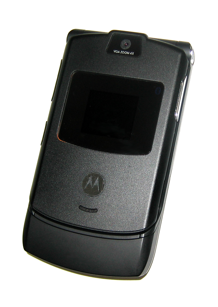
Verizon branded Razr
ISSUE: The Razr has both hardware and UI-based buttons positioned poorly. One example is an internet button that cannot be removed from interface; when its (accidently) hit a web-browser starts. A user has to wait 5-10 seconds for browser to start up before it can be exited, and is "charged" for transfering data.
PROPOSED SOLUTION: Allow users to remove (or disable) button from menu, speed up start-up time of browser, and do not connect nor charge users who do not purchase data plans.
MY SOLUTION: When my contract was up, bought an iPhone 3G. I paid more for the phone, and more for the monthly fee... but it integrates so well with my life I have no regrets. Also I'm finding that it works so well that I don't need another MP3 player, and no longer need to buy Franklin Covey refills. After 10 years, I'm going to stop using my 1/2 page planner. Thank you Apple for making my planner fit in my pocket.
Alpine CDA-9847 Car Stereo

ISSUE: The interface to set radio and head-unit options is clunky. The interface for interacting with and attached iPod is awful. While my first MP3 player, a "Diamond Rio 500", was convenient for playing MP3s, the iPod mini was the first MP3 player I owned that had an intuitive interface I could tweak without looking at while running. The interface on the Alpine CDA-9847 is so poorly constructed that it is dangerous to change songs on a connected iPod unless fully stopped, or a passenger is DJing.
PROPOSED SOLUTION: Perform usability tests with the unit and provide a firmware update that remaps the controls to one that allow a driver to effortlessly change song, artist, or album. If a firmware update cannot be performed, at least do this for future models.
MY SOLUTION: Since my average drive is 10 minutes, on weekdays, I can live with the shortcomings of this head unit. I'll add usability to my checklist when I am ready for an upgrade. I had originally selected this Alpine head unit because it was one of the few that could switch from one CD-written MP3 to another without a 0.5 second - 2 second pause. (I remember not finding a single Pioneer unit that didn't have this unbearable pause and being told by a phone-based customer-service rep that it was impossible to remove the delay.) Now any delays, on CD tracks written with MP3s, is not that big of a deal; a look-free user interface for a driver is paramount. The only thing more important is making sure the head unit works with properly with my car's stereo amplifier.
This ranting is long so I'll hold off talking about keyboards or operating systems. My parting observation: companies that offer a better user interface tend to have more attractive products. My attractive products can demand a higher price and tend to be in higher demand.
